UI UX
Designing evaluation around evidence, not just answers
Context
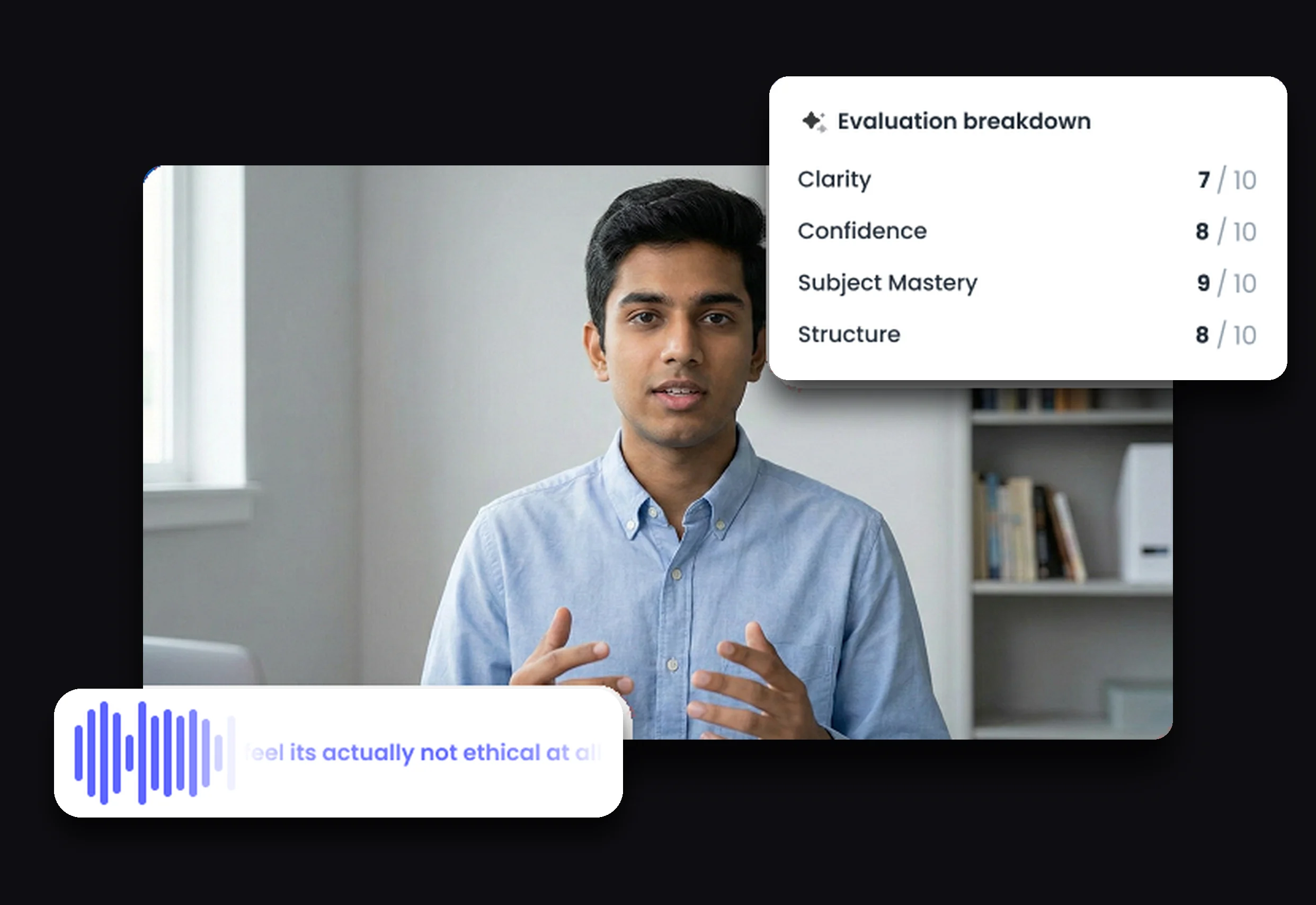
A video-assessment evaluation experience for faculty at partner colleges. Students record spoken responses, and faculty review and evaluate them against a rubric.
Faculty work through responses one at a time. An overview gives them a starting point, and a detail view brings together the student’s response, its supporting evidence, the AI’s evaluation and the rubric.
Who worked on it
The problem
Unlike a written exam, where answers can be skimmed, a video has to be watched in full.
The feedback we got was blunt.
“Faculty won’t scroll.”
Relayed by colleagues who spoke with faculty, not by faculty themselves.
It arrived as a rule rather than as the behaviour behind it. Taking the rule at face value would have turned the design into a cramming exercise.
The real problem sat underneath it.
Faculty aren’t just watching a video. They’re comparing evidence against criteria and making a judgment.
Explorations and decisions
Keeping evidence and evaluation together
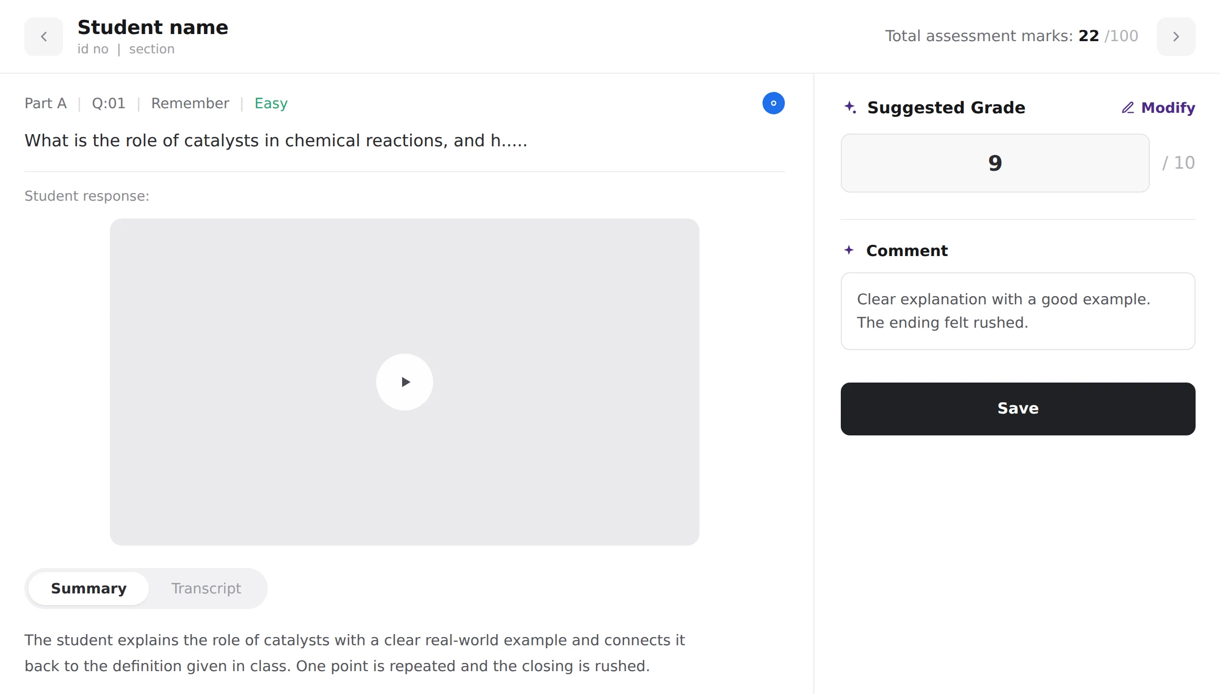
Our first version gave the response most of the space and hid the evaluation behind a disclosure. It looked clean, but grading meant constant movement between the response and the criteria.
We put the evaluation beside the response instead.
That reduced the available playback size, and it was the trade worth making. Faculty weren’t short of screen for the video. They were short of time and attention while comparing evidence against criteria.
Video first, then its derived representations
Each response has three representations: the video, a summary and a transcript. We stacked them rather than placing them side by side, because the evaluation panel had already taken the horizontal space needed for comparison.
Video leads because it is the original evidence. The summary and the transcript are derived from it. The summary is the fastest way to get the gist of a response.

AI-assisted scoring, with faculty in control
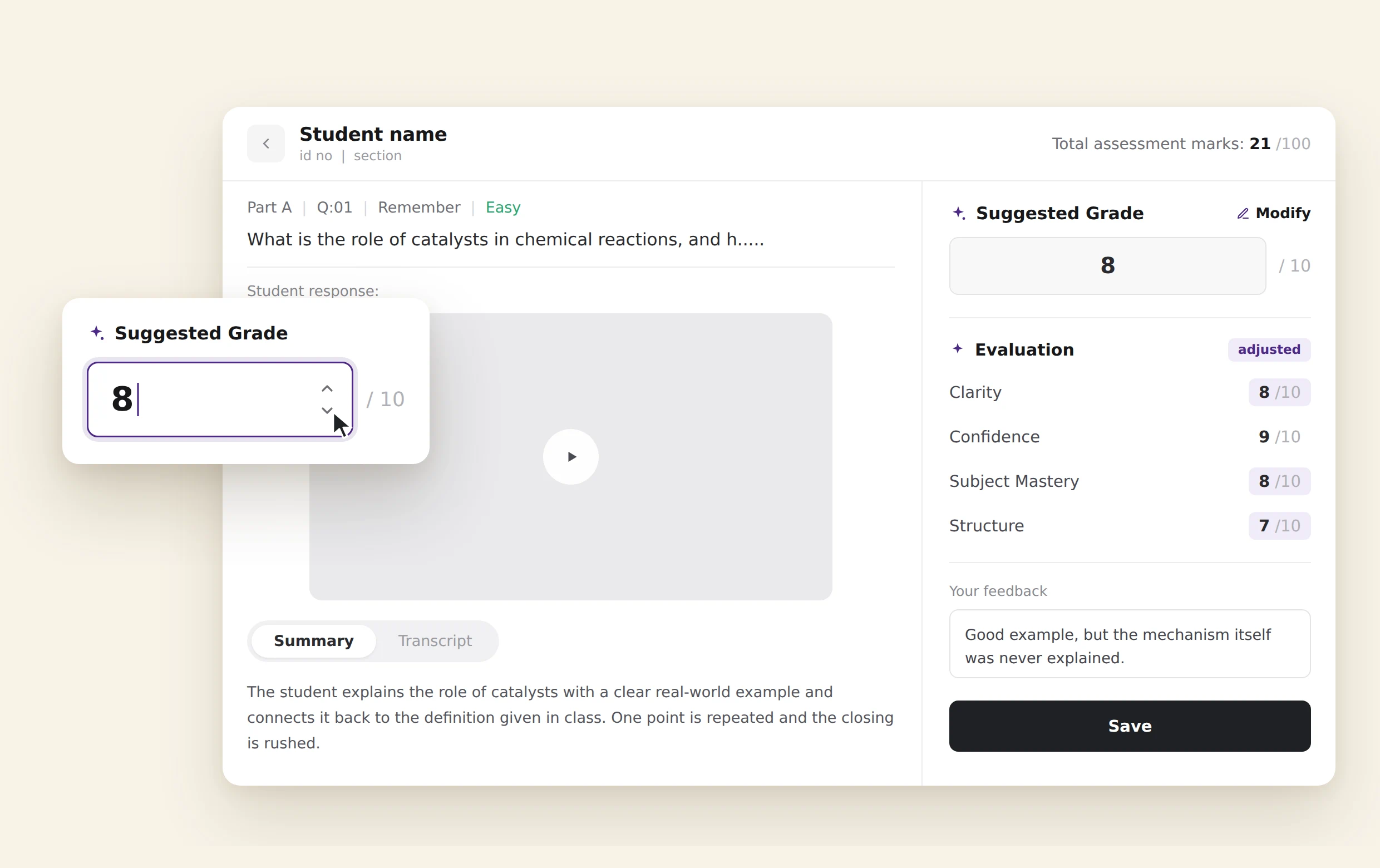
The AI pre-fills rubric scores rather than presenting a blank evaluation form, which turns scoring into an editing task rather than manual entry.
Faculty can adjust individual criteria and the overall score rebalances. Their written feedback sits alongside the AI’s evaluation rather than replacing it.
The design does not remove the risk of AI anchoring. It makes cross-checking easier.
Malpractice as evidence, not a verdict
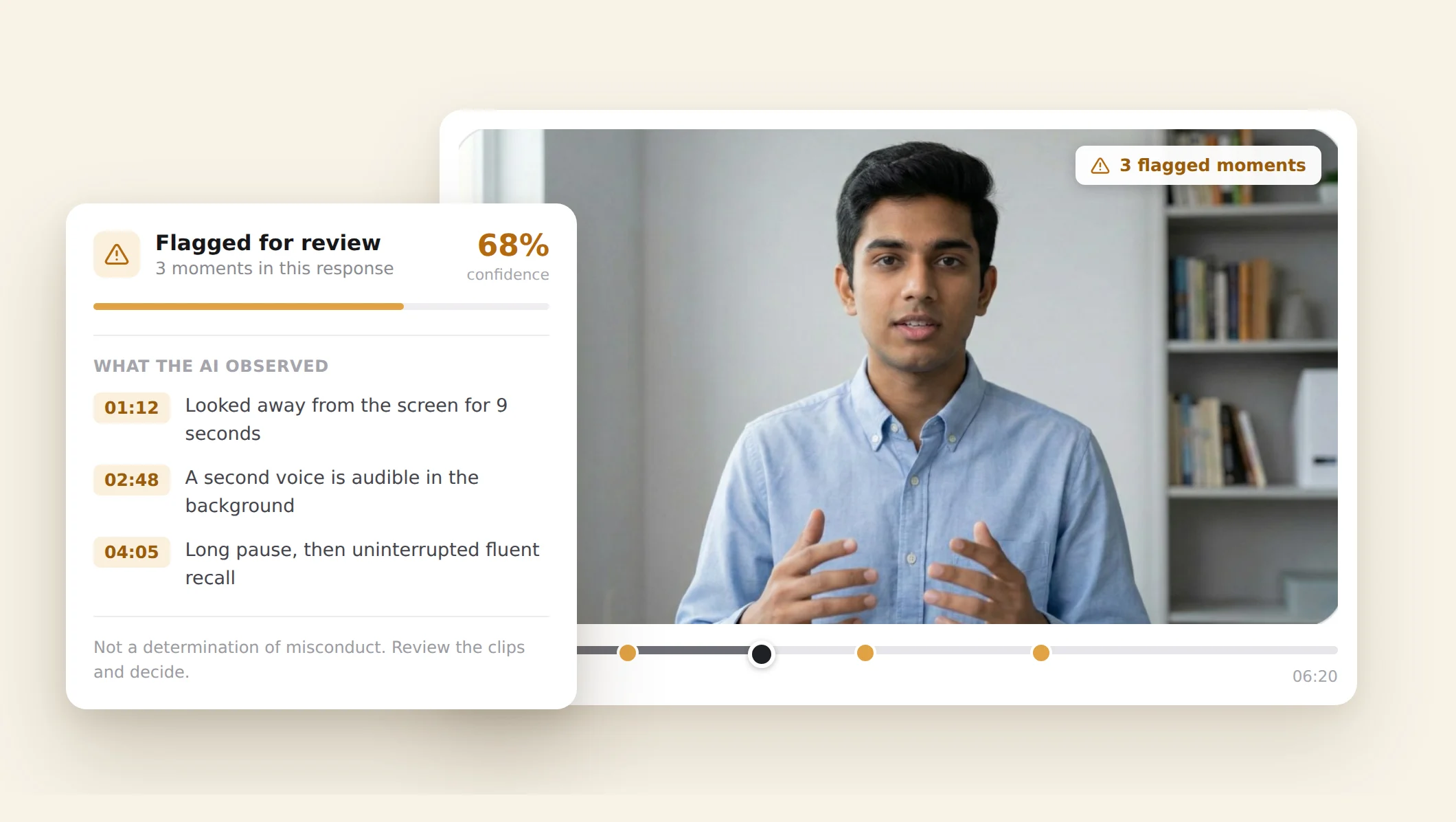
We deliberately avoided presenting malpractice as a binary AI judgment. The system surfaces what the AI observed, at specific timestamps, with a confidence percentage.
The AI says this is what I saw, and this is how confident I am. It does not say this student committed malpractice.
That distinction matters because an academic-misconduct judgment has consequences beyond the interface. The evidence needs to be quickly checkable, and the decision stays with faculty.
The final design
Summary and transcript
The video first, then the summary, then the transcript.
One control switches between the two derived views, so they share a place under the response rather than competing for one. Every passage in the transcript carries its own timestamp.
The evaluation panel
The evaluation panel sits beside the response. Scores arrive pre-filled, and faculty adjust individual criteria while the overall score rebalances.
When a criterion is overridden, the AI’s score is replaced by the faculty member’s and the AI indicator on that criterion switches off, so the score reads as theirs rather than the system’s. The change is confirmed separately, and until it is confirmed the AI’s score can be restored.
Written feedback sits alongside the AI’s evaluation rather than replacing it.
Malpractice observations
Each observation is pinned to a timestamp in the response and carries a confidence percentage, so it can be checked against the video rather than taken on trust.
What I’d measure
Two things. How far the time to evaluate a response actually falls, measured per response rather than per assessment, because a response is the unit the work is done in. And how much faculty lean on the malpractice timestamps, since they exist to be checked and how often they are opened is what says whether the flagging is being used or skipped.