Branding
Brand refresh for Edwisely
Context
Edwisely is an edtech startup. Before this, the brand had an agreed colour set and no rules around it, so every piece was built from scratch and nothing shared a feel. Version 1.0 of the guidelines was released in July 2026.
Who worked on it
All three of us worked across colour and the rules. I also directed how the brand should feel and signed off the final system.
Earlier visuals
There was no fixed palette, so any purple or blue got used, and recurring formats were designed from scratch each time with no set layout, headline treatment or logo placement to reuse.

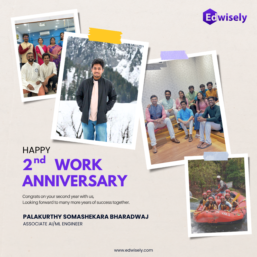

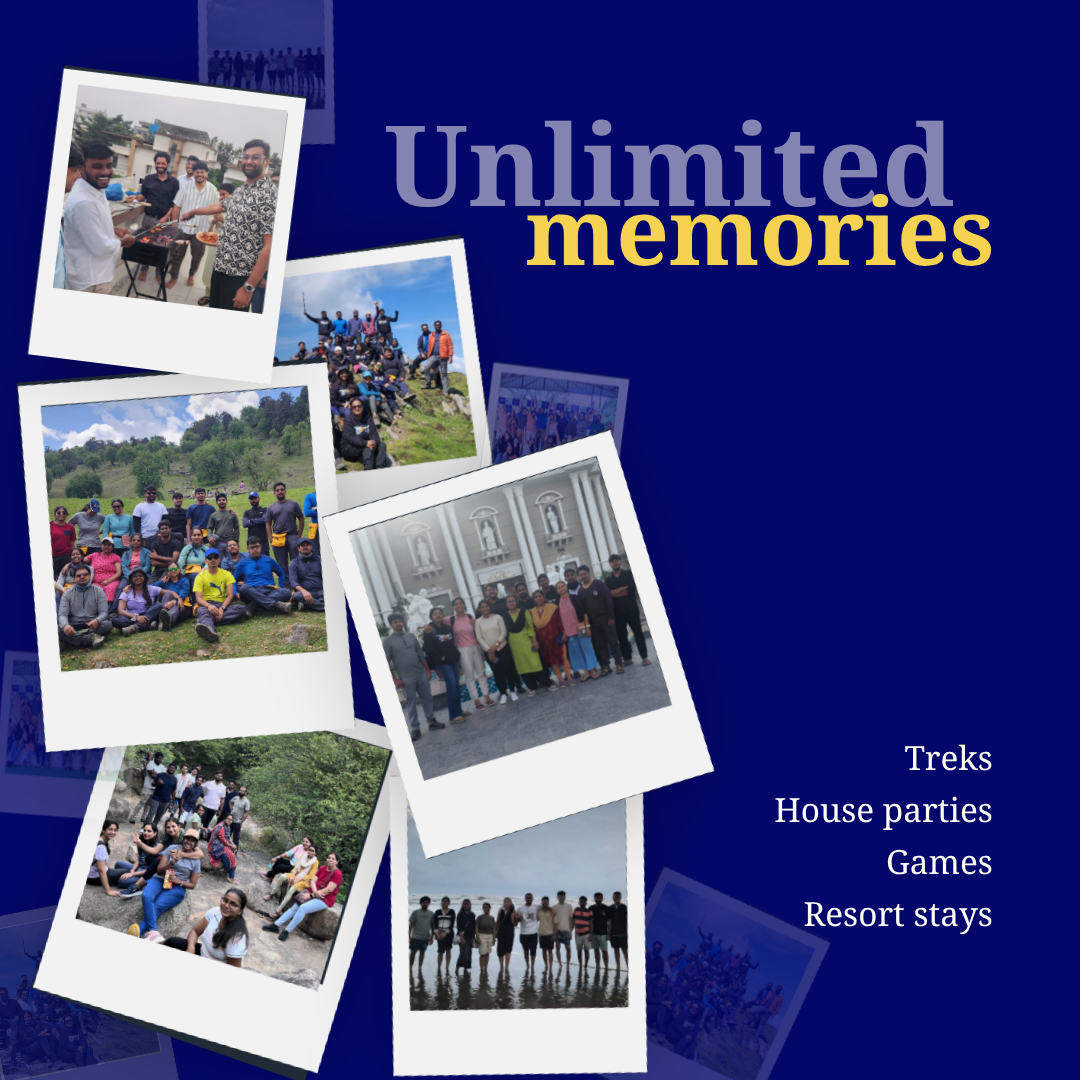
Two things caused the drift. There was no defined brand style for teams to follow, so internal teams did not understand the brand and used the logo incorrectly, which we also saw at events. And the primary purple was too saturated to have a reliable print equivalent, so print never matched screen.
The brief
The ask was simple: change the colour only if it needed changing. The diagnosis came from what could be observed: pieces already in circulation, how internal teams used the assets, and how the brand held up at events.
Explorations and decisions
Three colours explored
The old purple was heavily saturated. It was too much on screen, and there was no reliable print equivalent for it, so printed material never matched what people saw. We looked outside purple before deciding.
Lime green and darker purple (#E7EB23, #3B2E6E)Rejected
The lime was rejected collectively: paired with the purple it read as grocery and organic, which is the wrong category entirely. The darker purple was dropped for a different kind of reason, since on text it was indistinguishable from black and so earned nothing.
Pale yellow and Premium purple (#FFE863, #4D2A8F)Rejected
The paler yellow came from a worry that the brand yellow was too bright, and it solved that at a cost, draining the spark the yellow is there to carry.
The chosen one (#4D2A8F, #FFE100)
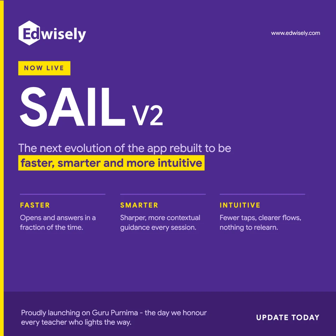
We ended up on purple again, with a different code. The brand needs to read premium and purple gives that. It was also already what people recognised: wherever the old purple had worked, the purple and yellow pairing was what they associated with the company, and a few schools use a similar combination.
The replacement was picked with its CMYK build in mind from the start, and the guidelines publish the digital and print values together rather than leaving print to be derived later.
Space in the mark
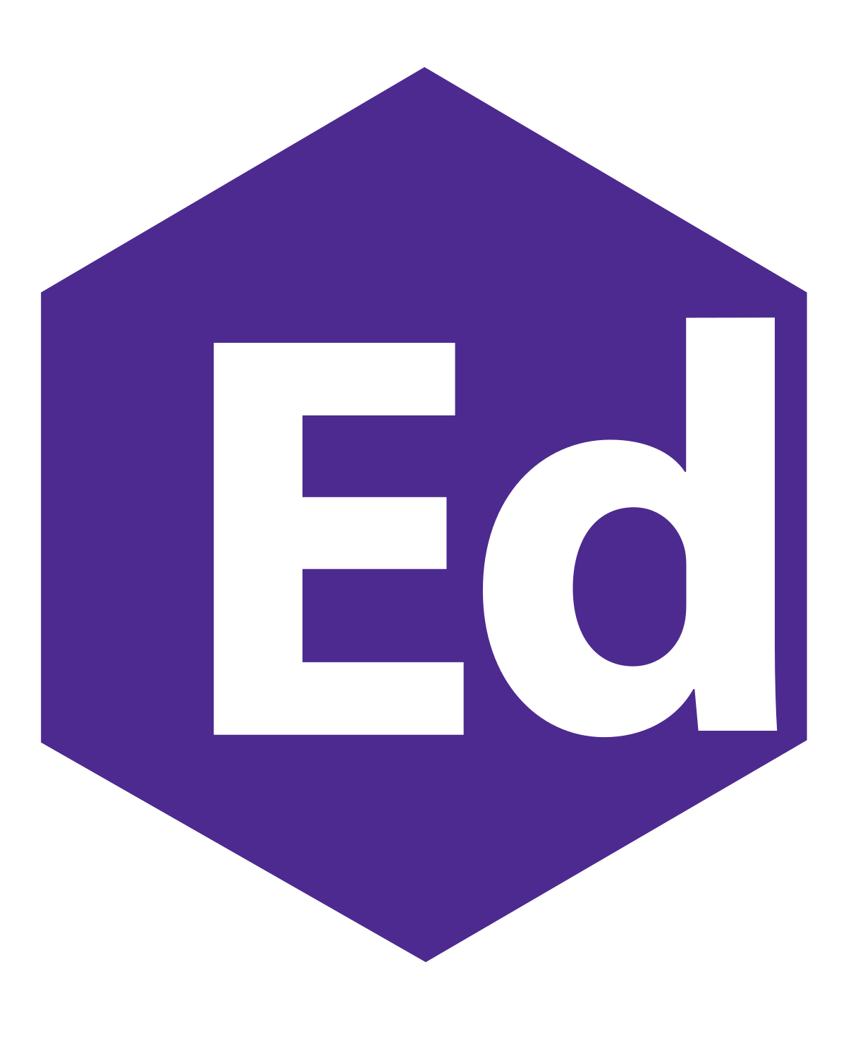
In the old mark the d sat almost on the edge of the hexagon, which caused problems in print. We opened the spacing, but deliberately not by much. Edwisely has to read as one word, and past a certain point the gap starts reading as ed-wisely instead.
A constraint pushing from both sides. Print legibility wanted more room, word cohesion capped it, and the answer sits where both are just satisfied rather than either being fully served.
Removed gradient
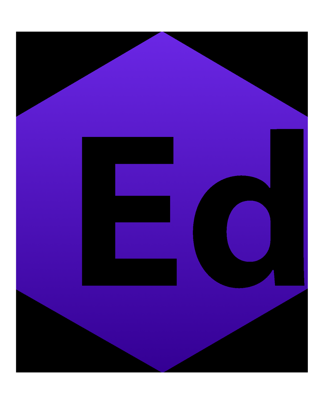
The old logo carried a gradient across the whole mark. We built a version of the new one with a gradient too, and it looked about as good as not having one, so it was earning nothing while costing reproduction complexity in print and at small sizes.
The founders did not want gradients either, on the grounds that they had become the default look for anything selling itself as AI. Two independent reasons pointing the same way made it an easy call.
Final branding